/background(fff)/960x621.jpeg?auto=webp)
Magazine Cover/Spread
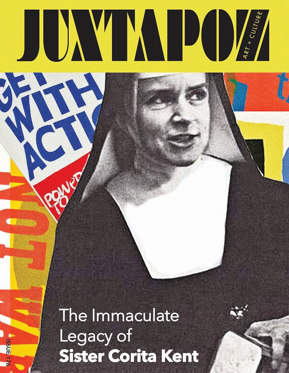
This magazine cover and two page spread are designed to project the boldness and impact of Corita Kent’s revolutionary, politically-charged, pop art. Her powerful slogans, appropriated from advertisements, are tweaked and reassigned new significance through the process of serigraphy. Within the magazine cover, several of her works are dynamically layered with her iconic image in the foreground. The typography of the magazine title also points to the strong emphasis on design. Bold colors are used for continuity throughout the two page spread which includes Kent’s famous “Wonder Bread” dots with text overlay. The magazine cover and logo were designed in Illustrator. The two page spread was created with In Design.
Book Cover
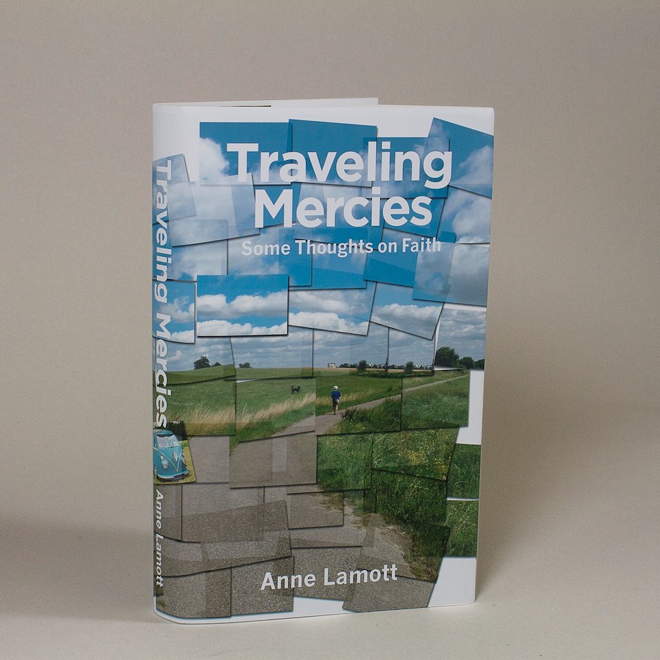
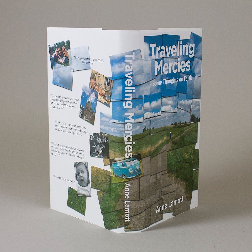
Lamott’s spiritual journey is presented as a patchwork of memorable people and times through the use of a photo collage (appropriated from David Hockney’s Pear Blossom). The photograph I used to illustrate the story is one I took of a dear cousin out with her dog in the German countryside. The “travel” is referenced by the path she is walking which transitions from the foreground and rises up to a stunning sky. Additional “snapshots” are tucked in representing the important people and events in the author’s life. The David Hockney effect was created in Photoshop. Illustrator was used for the final book cover format.
/background(fff)/960x960.jpeg?auto=webp)
/background(fff)/960x960.jpeg?auto=webp)
/background(fff)/960x960.jpeg?auto=webp)
Packaging/Album Cover Design
This album cover and its insert are a tribute to Alex Steinweiss who is known as the Father of Modern Album Cover Design. The cover (front) uses components of Steinweiss’ work, most notably concentric orbs and the silhouette of a hand. His name is spelled out in the font he made famous, the “Alex Steinweiss Scrawl.” The reverse of the cover notes important dates in Steinweiss’ life and is organized to resemble an album playlist. Also noted, is the LP logo which was created by Steinweiss. The insert (part 1) comprises a collection of his sixteen album covers which show off the most recognizable elements of Steinweiss’ style. This was created using Illustrator.